Our Location
304 North Cardinal St.
Dorchester Center, MA 02124

304 North Cardinal St.
Dorchester Center, MA 02124
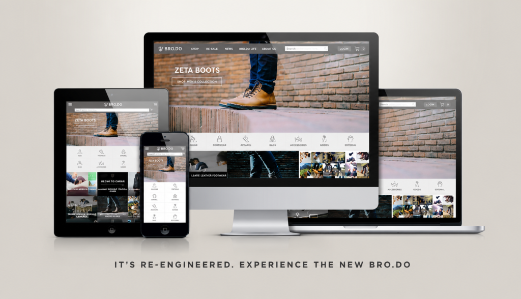
Background & Challenge
Brodo Footwear is an Indonesian menswear brand built on direct-to-consumer sales and a loyal, young-professional customer base looking for quality leather shoes at fair prices.
Founded in 2010 by two engineers, Brodo grew quickly online, but by the mid-2010s its identity hadn’t caught up with the brand’s ambitions. The brief was straightforward: redefine the identity into something more professional, mature and dapper, in line with what its customers already expected from the product.
Research & Process
Alternative Logo
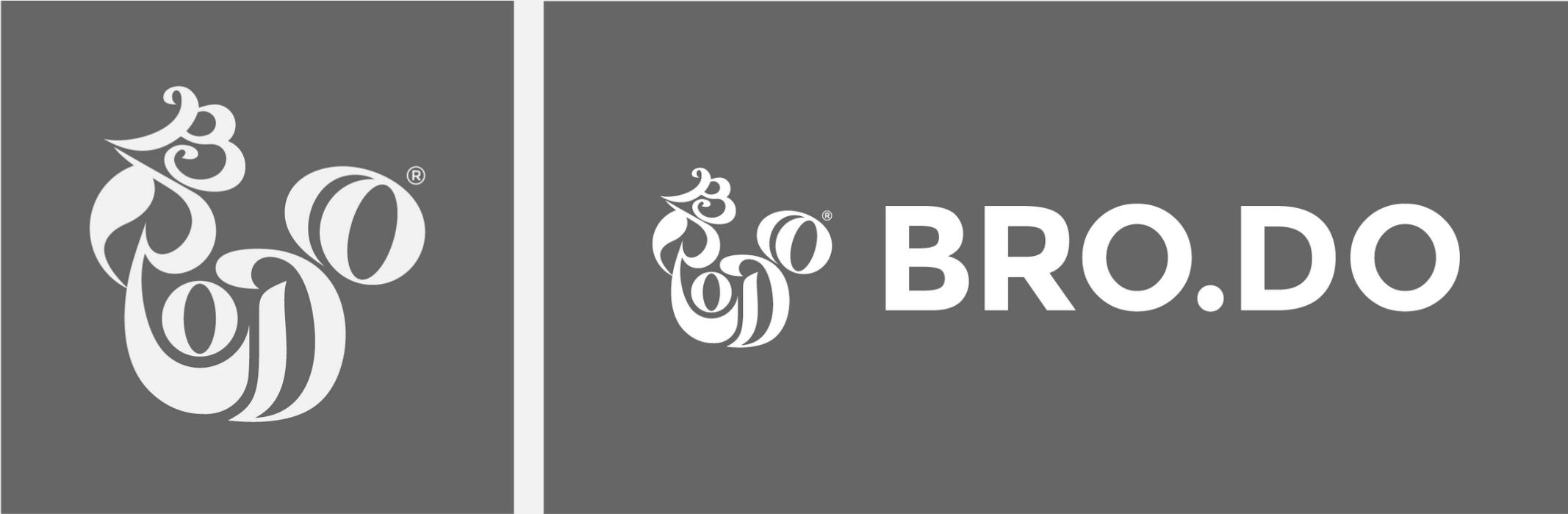
As the brand aims to bring a more methodical approach on their visual identity, the logo is considered to be redefined.The old one has a combination of logogram and logotype in one image, brings a more ornamental and craftmanship impression on it. While the alternative logo is projected to bring the dynamic and straightforward touch in separate visual element.
The transition of the identity, especially the logo, colours, and the selection of typefaces, are gradually applied through the year (started in 2015). Eventually, the brand identity made into its full transition in the middle of 2018.
Former and ‘in transition’ logo (2015-2018).
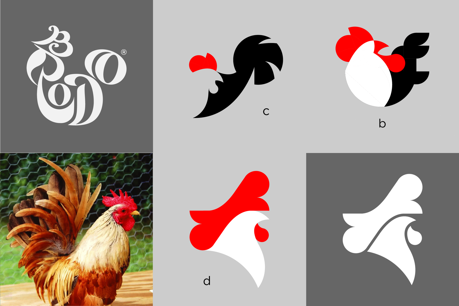
The drafts, the alternatives and the development. The Rooster image was still being adapted as an icon of the brand.
Thoroughly redefined logo (2018-present). Adapting the brand’s motto: “We Have a Bright Future”, the rooster has to make a turnaround, facing forward to the bright future.
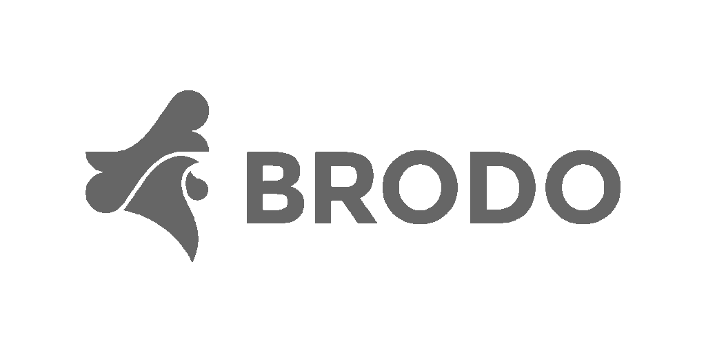
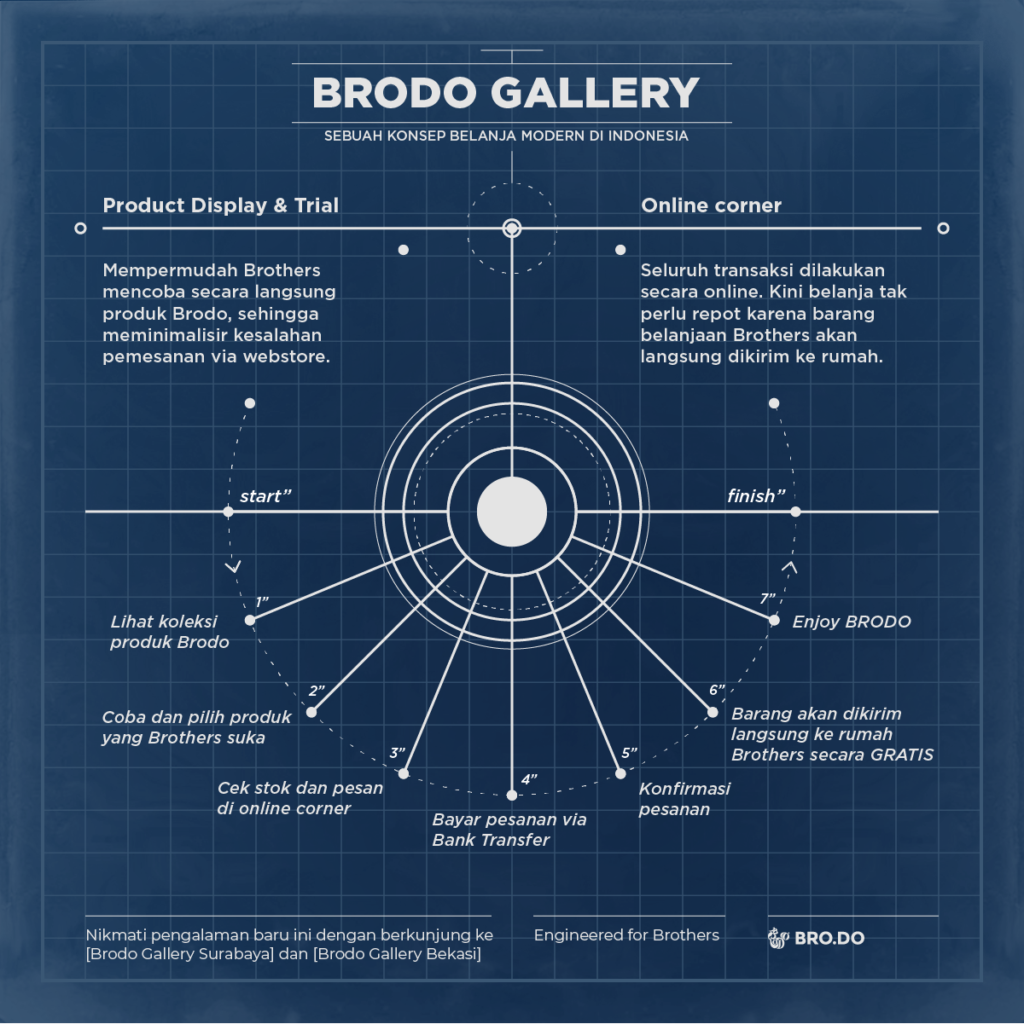
Identity system in development, from logo to store collateral.
Brand Identity Catalogue
To maintain the engagement with their existing-loyal customer, Brodo made a mini-publication consist of their manifestos and several ranges of their collections. The catalogue distributes during brand activation/event in several cities following the regional promotional campaign.
View the digital Catalogue.
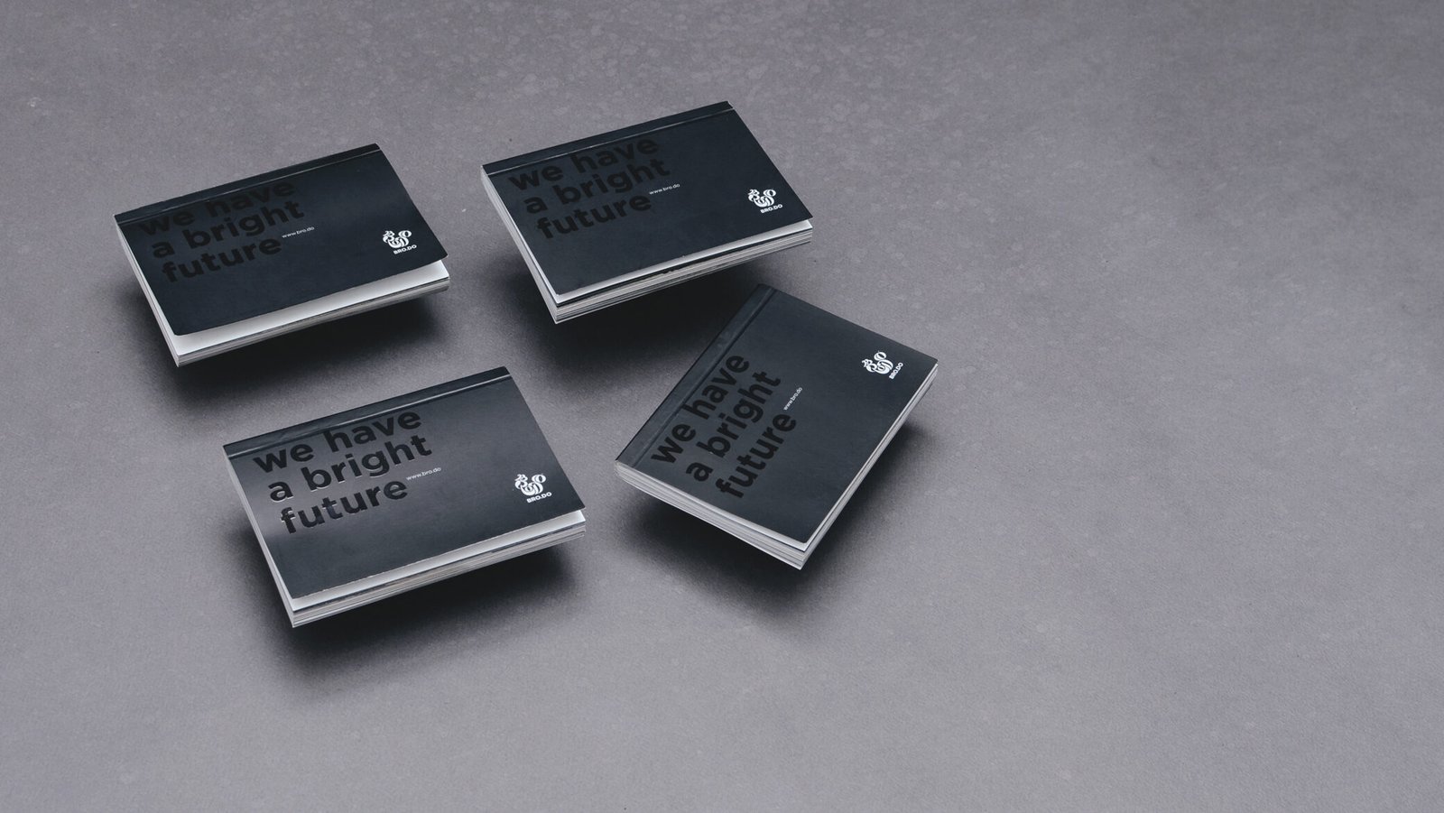
Identity system in development, from logo to store collateral.
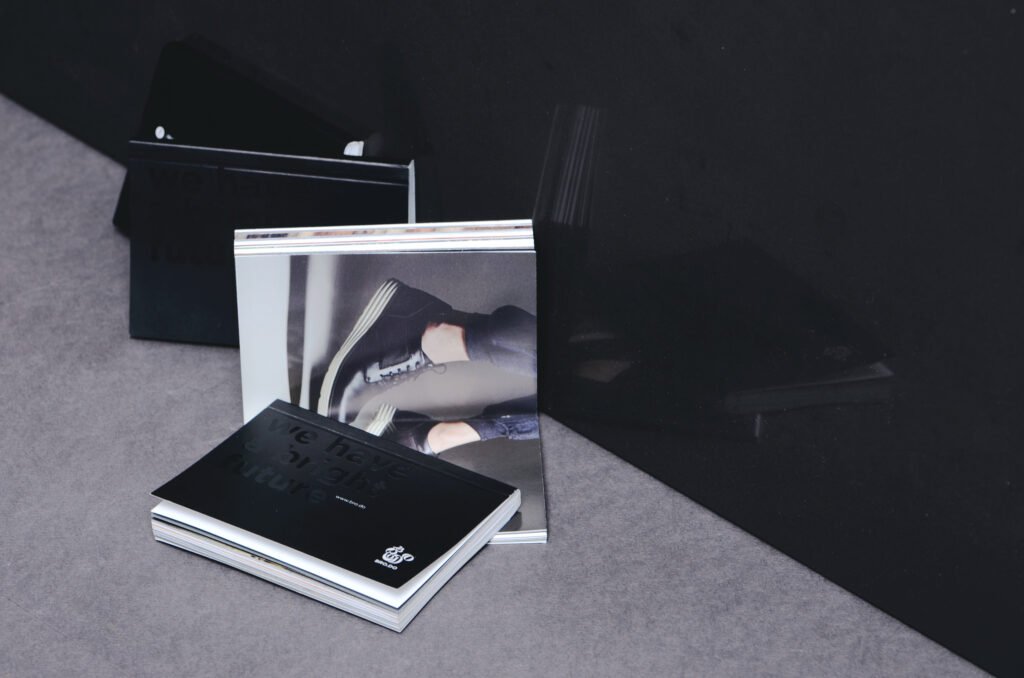
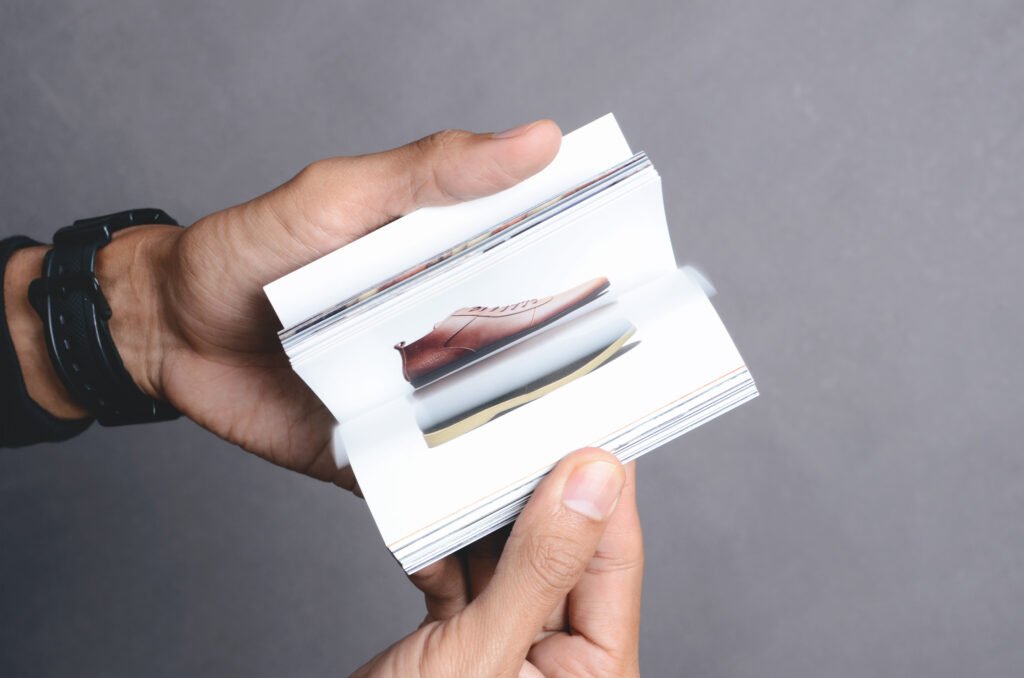
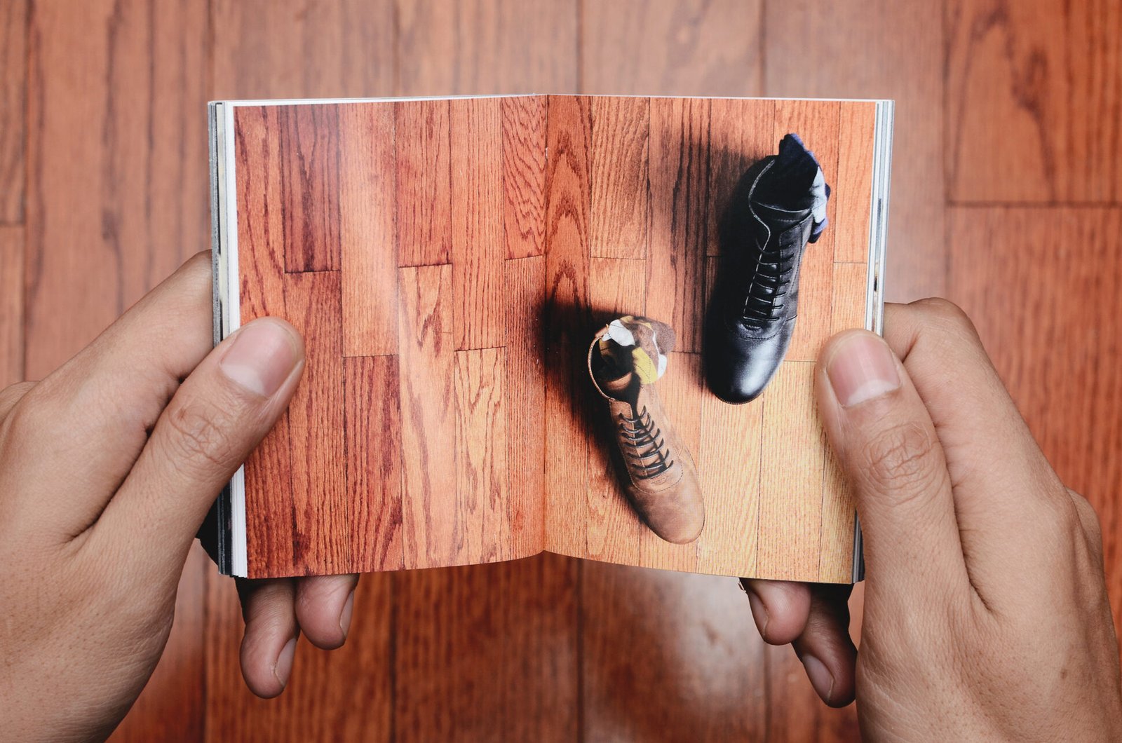
Research & Process
The work covered the full system: a redesigned website and UX/UI, business cards, catalogues, monthly product brochures, member and promo cards, and seasonal print pieces like Eid greeting cards. The logo itself moved from an ornamental, hand-crafted-looking mark into a cleaner, more dynamic rooster symbol, rolled out gradually from 2015 and fully adopted by 2018.
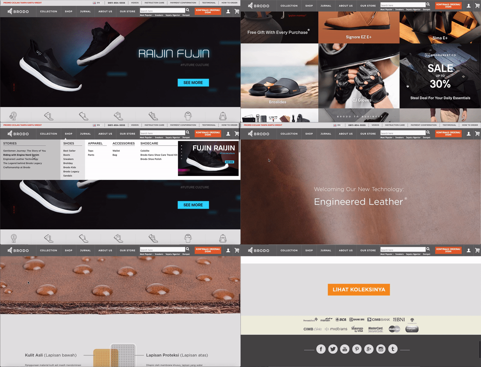
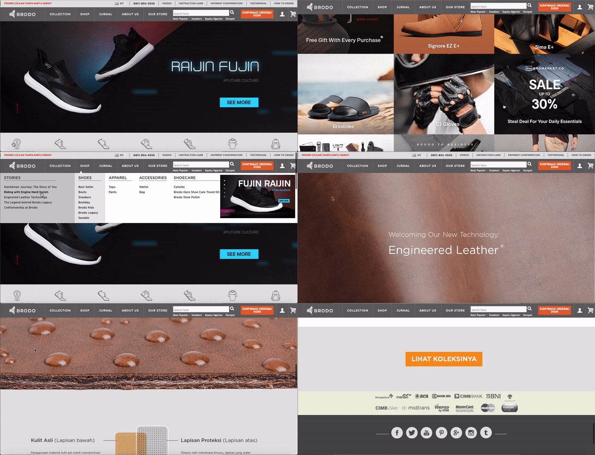
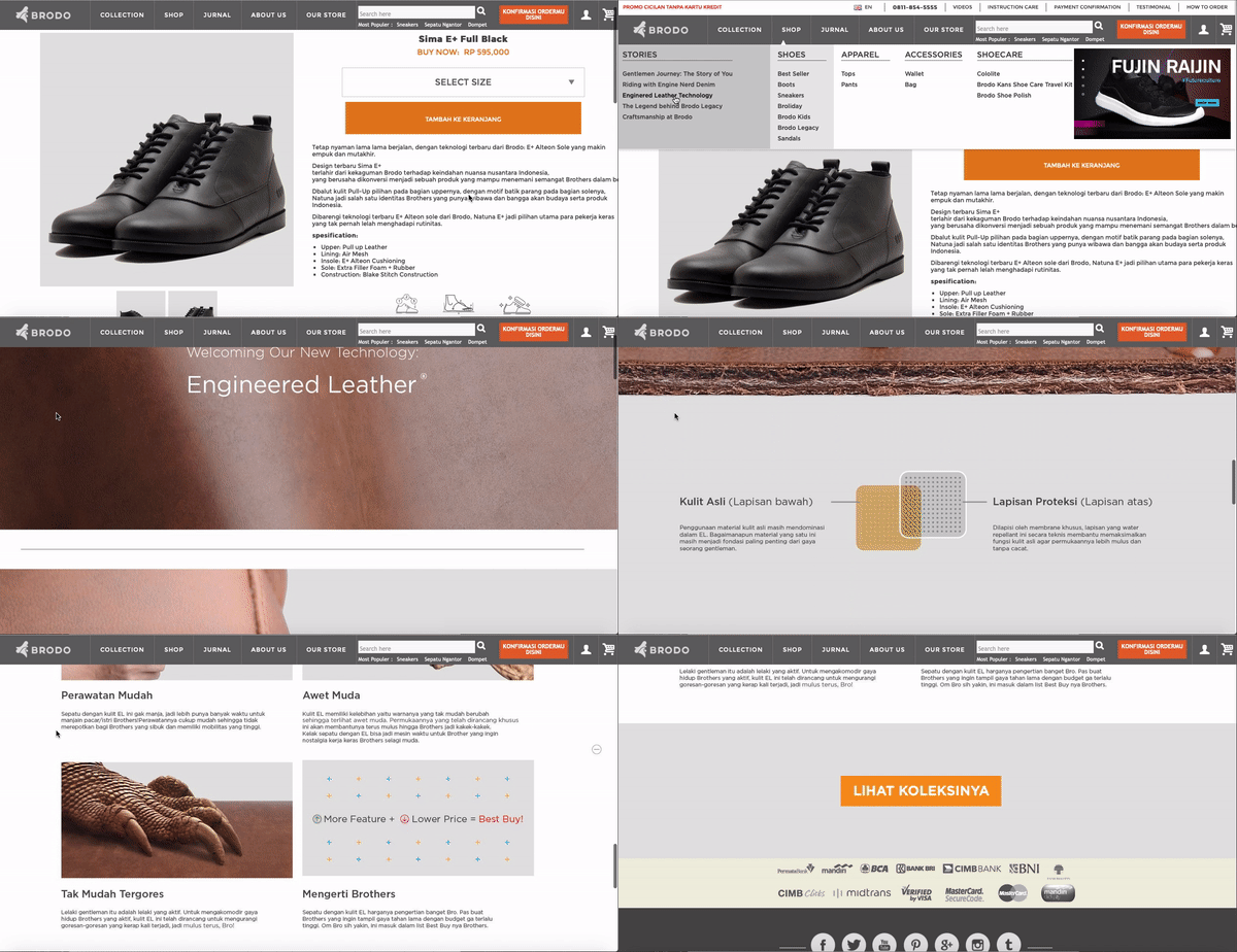
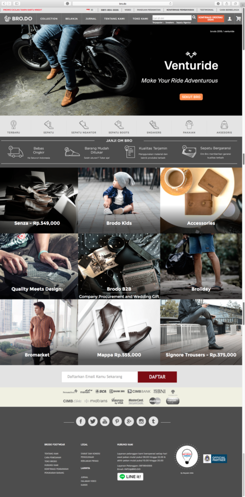
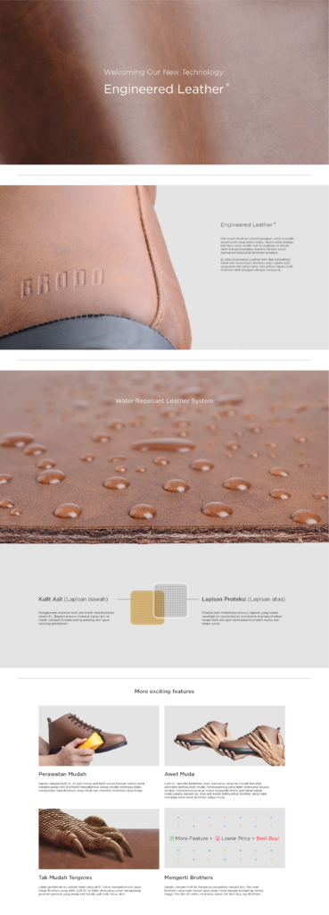
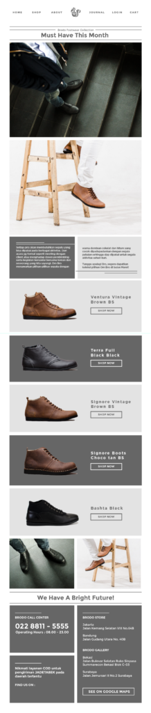
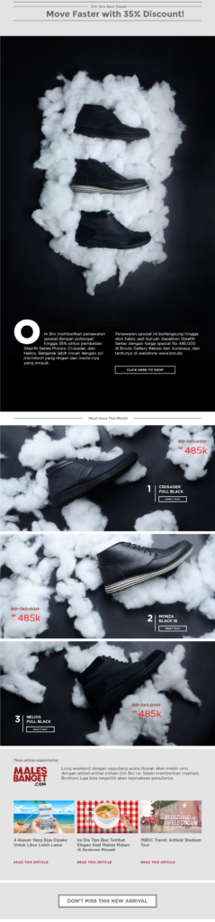
Identity system in development, from logo to store collateral.
Research & Process

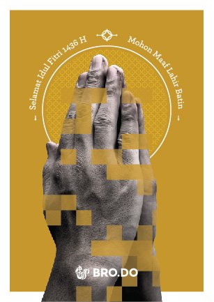
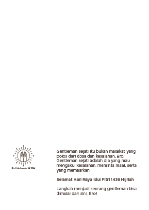
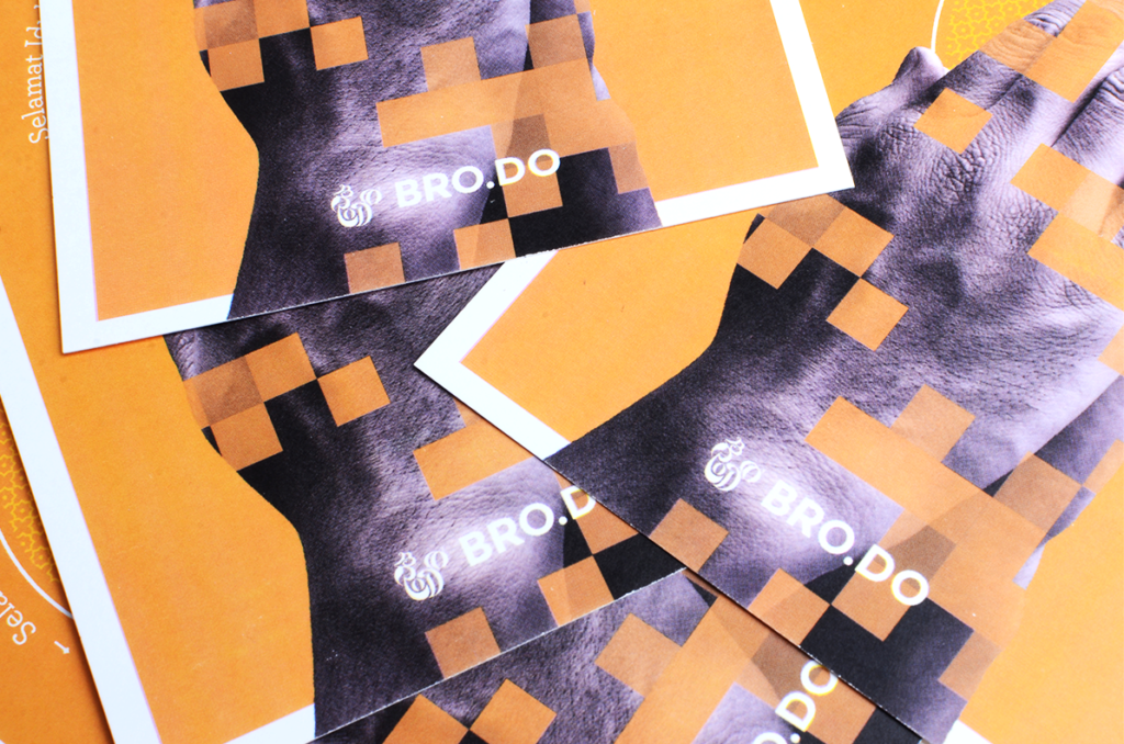
Greeting Cards + Gift Card
Greeting cards on the most celebrated event in Indonesia, Eid al-Fitr. As a religious event which joy and blessing are the main essences, the gold colour heightened the value of this glorious tradition. Since Gifts are commonly exchanged during Eid by young and old alike, the customised greeting cards produced for the gift to the near and dearest one.
Business Card
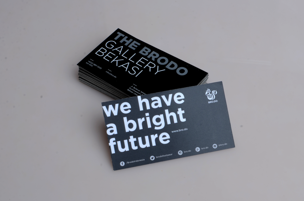
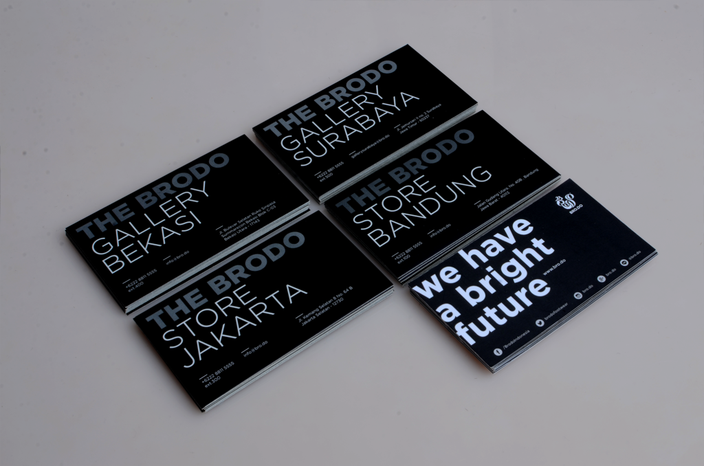
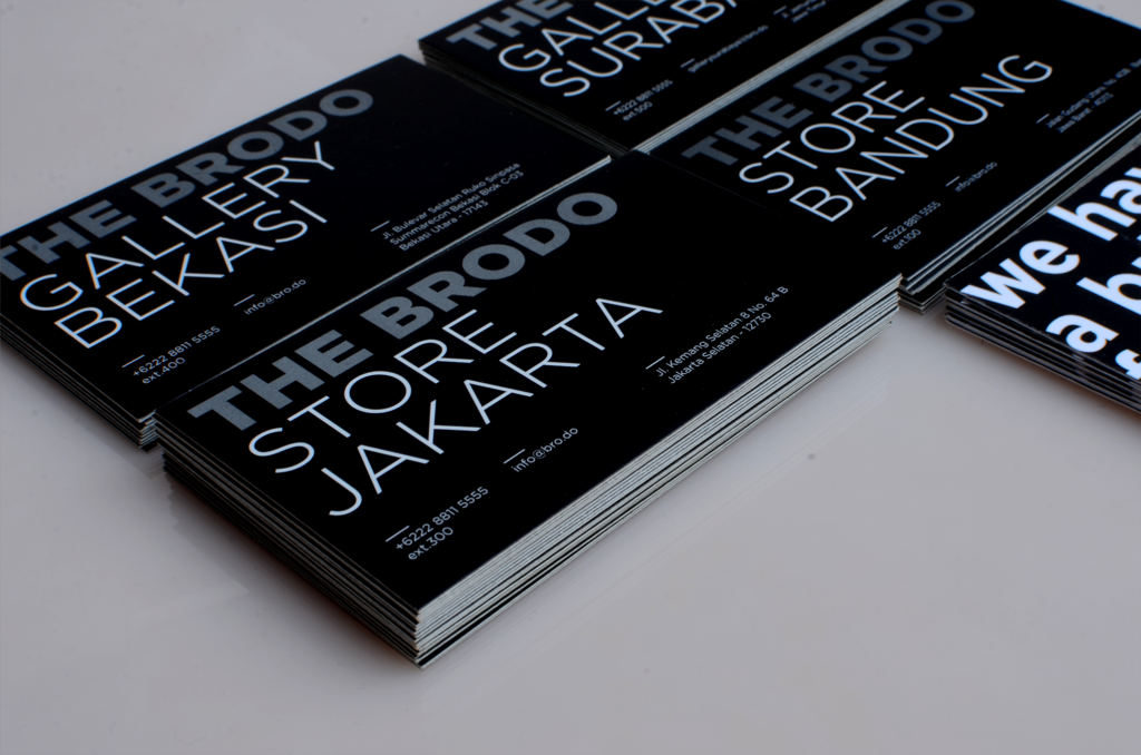
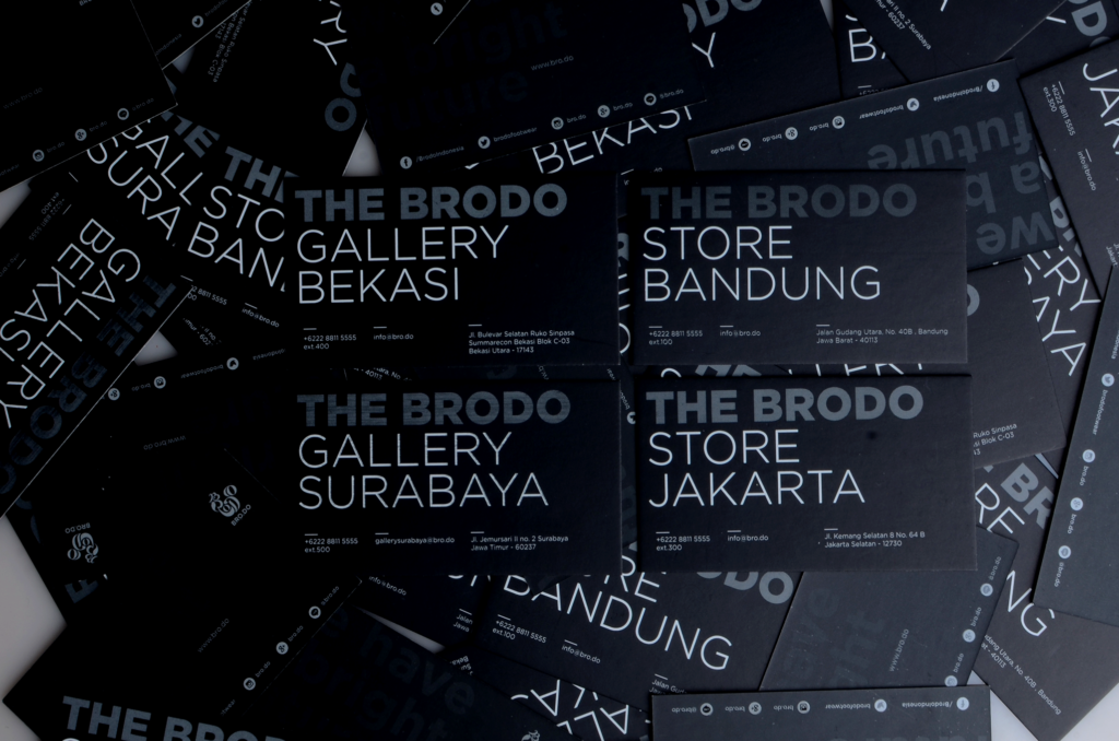
Brand Collateral: Product and Promotional Brochure
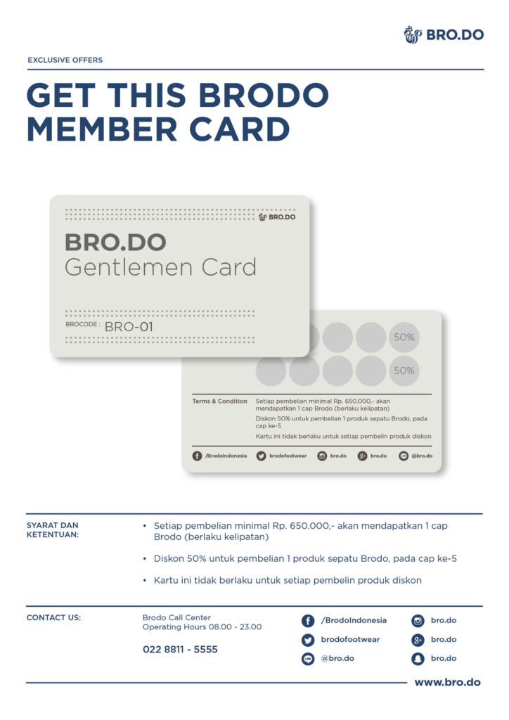
Monthly brochure of Brodo latest selected product, followed by insightful advice for the customer on how to put the proper treatment on his/her beloved shoes.


Printed Promotional Brochure
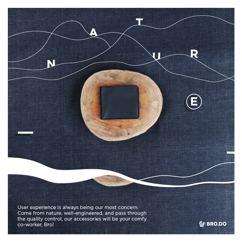
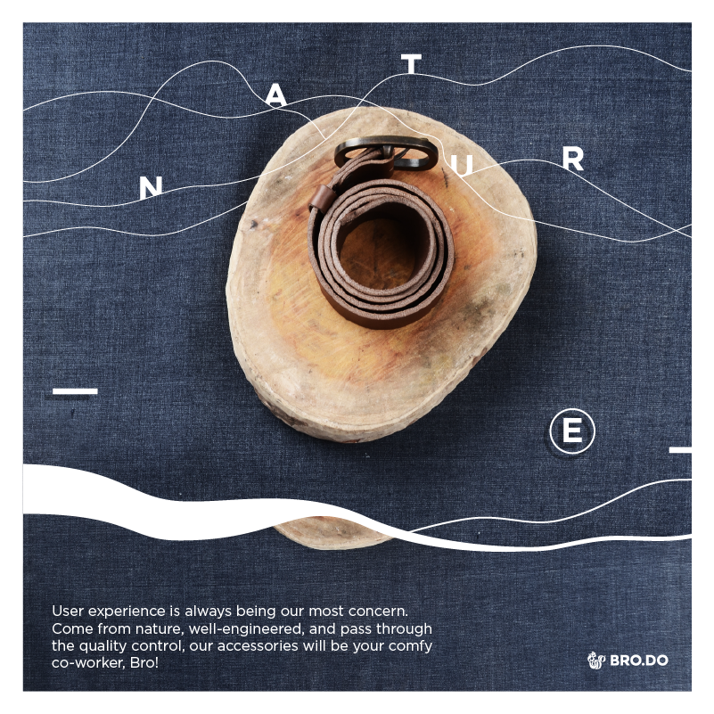
Poster for printed and digital media
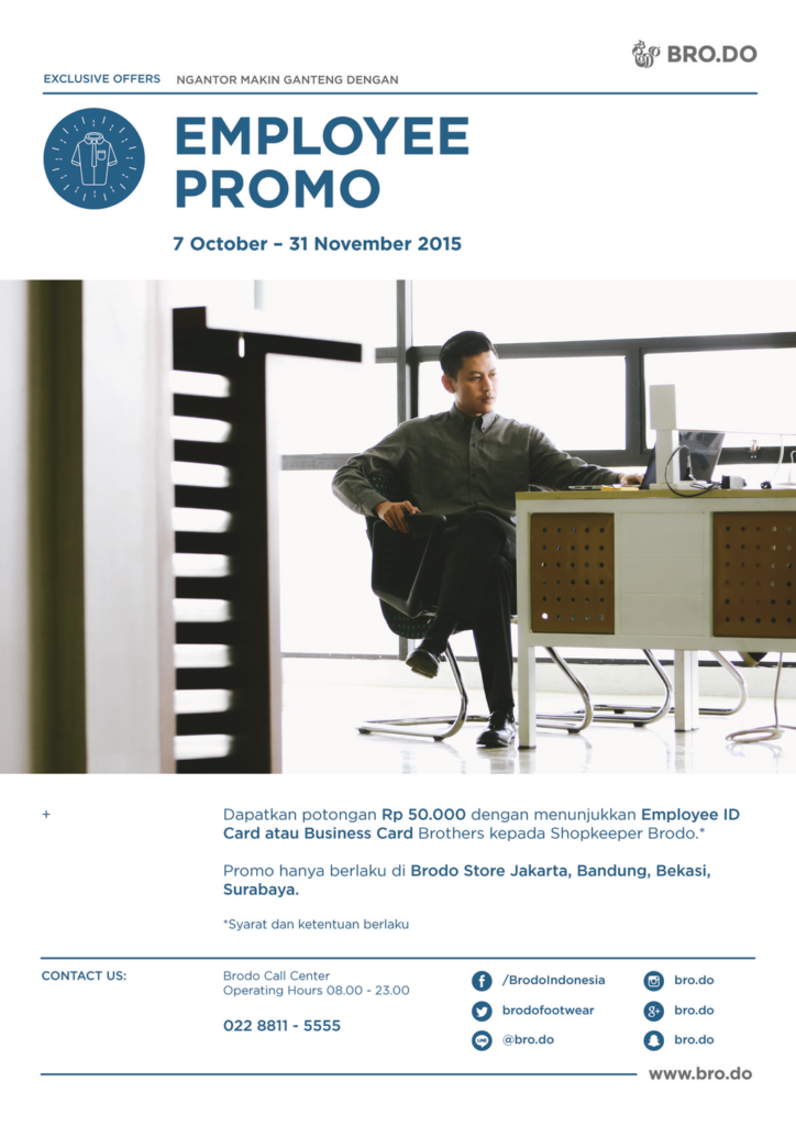
Aside from ordinary the banner across the website that supported by google ads, Brodo had an occasional promotional advertisement on various media. Both in printed magazine and on the digital platform.

Poster for printed and digital media
Aside from ordinary the banner across the website that supported by google ads, Brodo had an occasional promotional advertisement on various media. Both in printed magazine and on the digital platform.



Reflection
A brand should look as considered as the product it sells.
Working across every touchpoint, from packaging to UX, taught the value of a system that scales consistently as a business grows.
Credits
Graphic Designer — Muhammad Fajrur Rahmat
Web Designer — Andre Ferdinata & Fajrur Rahmat
Project Manager — Fikri Gustin
Copywriter — Febri Fawzi
Photographer — Arif Hidayat
Client — Brodo Footwear, Bandung
Year — 2015–2016
