Our Location
304 North Cardinal St.
Dorchester Center, MA 02124

304 North Cardinal St.
Dorchester Center, MA 02124
2021 — Brand Identity — Update Status — supported by USAID, FHI 360, EPIC
Background & Challenge
Update Status is a sexual health platform for Indonesia’s MSM community, and this rebrand rebuilt its voice, colour, and interface around that narrower, sharper mission.
Update Status previously spoke to both MSM and FSW audiences. This rebrand shifted the focus to MSM alone, which meant rethinking design, colour, visual direction, and user experience across the board, not just the logo.
The brief was to make health information easy to understand and easy to act on: content that pushes people to check their sexual health status or keep up with treatment, without sounding clinical or condescending.
Research & Process
The team built a set of brand messaging pillars — Maintain Status, Update Story, Update Status, Other Updates, and Influencer Content — each paired with its own supergraphic icon. A verbal tone was mapped out too: casual, witty, and enthusiastic, built to explain medical information from consulting doctors without confusing or condescending to the audience.

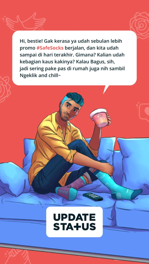
Since most of our back-and-forth communication with our audience happened via text, our writing tone could determine our existence. Hence, we utilize a casual, witty, easy-to-understand, and entertaining way of typing. This way, we can give the audience the information or answer they need without seeming condescending or annoying. In short, we can relay information provided by our consulting doctor packed with medical terms without confusing our audience or reducing its message.

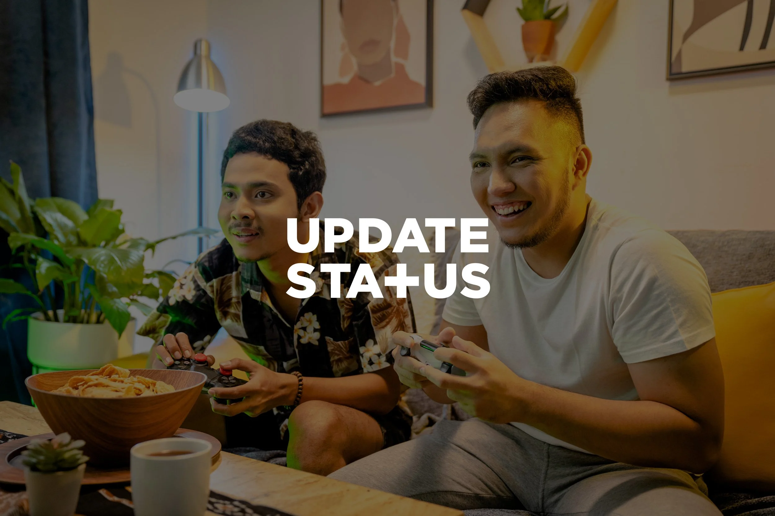
The visual system followed the same logic. A simple wordmark with a plus sign standing in for the T anchors a broader palette of five new supporting colours added to the original three. Illustration stays deliberately simple and geometric, and photography is graded consistently to feel hopeful and warm rather than clinical.

Update Status logo is designed to be a simple wordmark created in any brand’s official colors.


This rebrand added several new, more diverse colors, such as Light Salmon, Medium Champagne, Cornflower Blue, Mulberry Crayola, and Electric Blue, to the previous three primary colors (Rich Black FOG, Tart Orange, and Light Goldenrod Yellow).

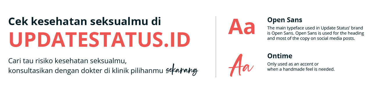
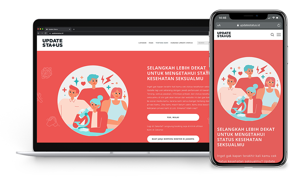
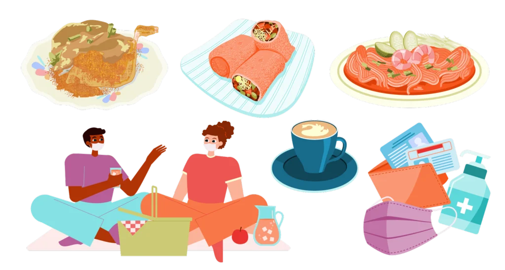
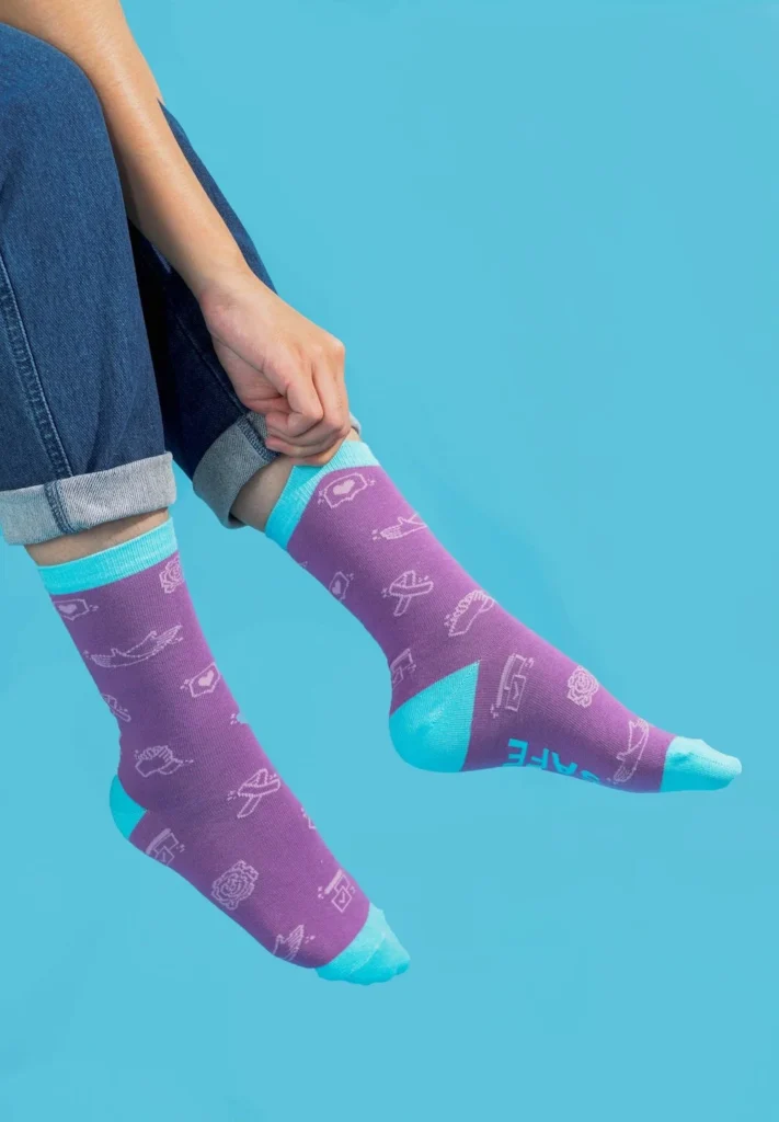
In terms of illustration, supergraphic icons, and scribbles, we focused on simple geometric shapes where the characters and objects aren’t too detailed to prevent them from making the overall design over-complicated. In general, this new visual direction aims to create fresher, friendlier, and more fun content for the audience without diminishing the educative and informative points.
The visual system followed the same logic. A simple wordmark with a plus sign standing in for the T anchors a broader palette of five new supporting colours added to the original three. Illustration stays deliberately simple and geometric, and photography is graded consistently to feel hopeful and warm rather than clinical.
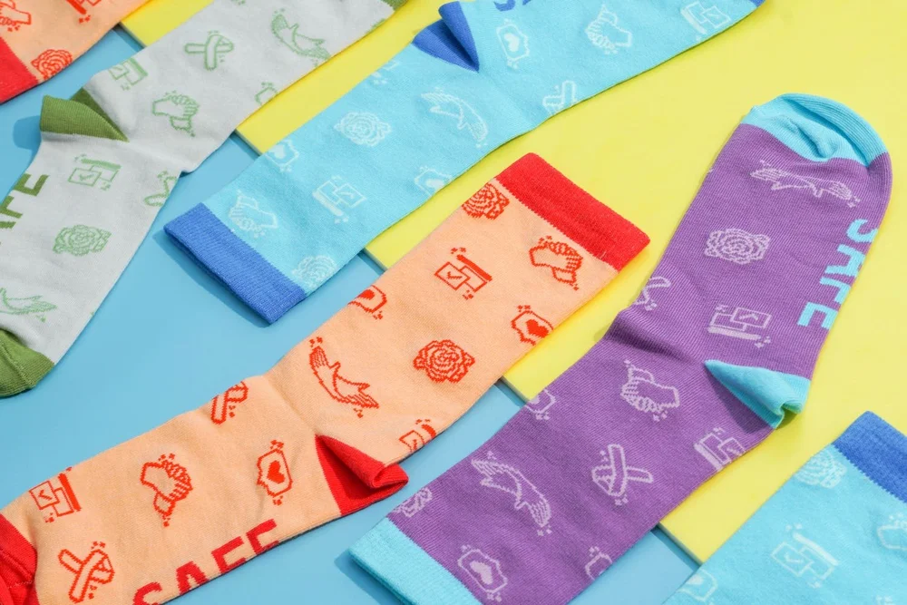
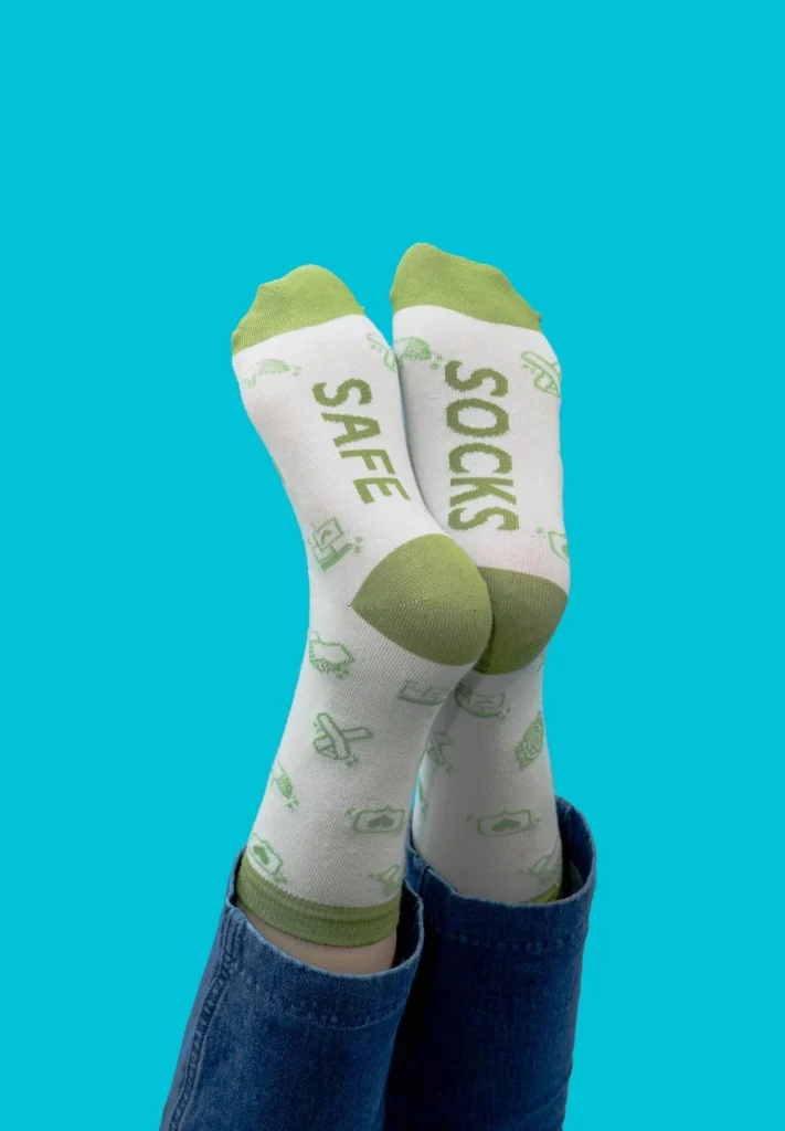
Our supergraphic icons symbolize our brand messaging pillars. They are designed with several key object elements best to represent each pillar for our audience’s understanding.
Supergraphic icons built for each brand messaging pillar, designed to read instantly on social.




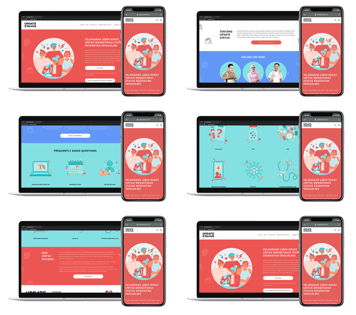
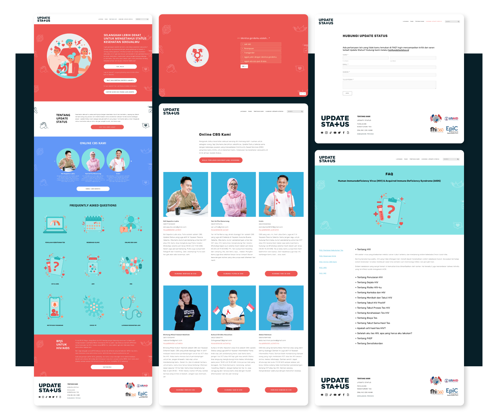
While our source of photos could be varied, such as for photoshoots and online stock photos, we are always consistent in their grading treatment. We try to convey color tones that bring hope, fun, and a bright vibe for the audience.
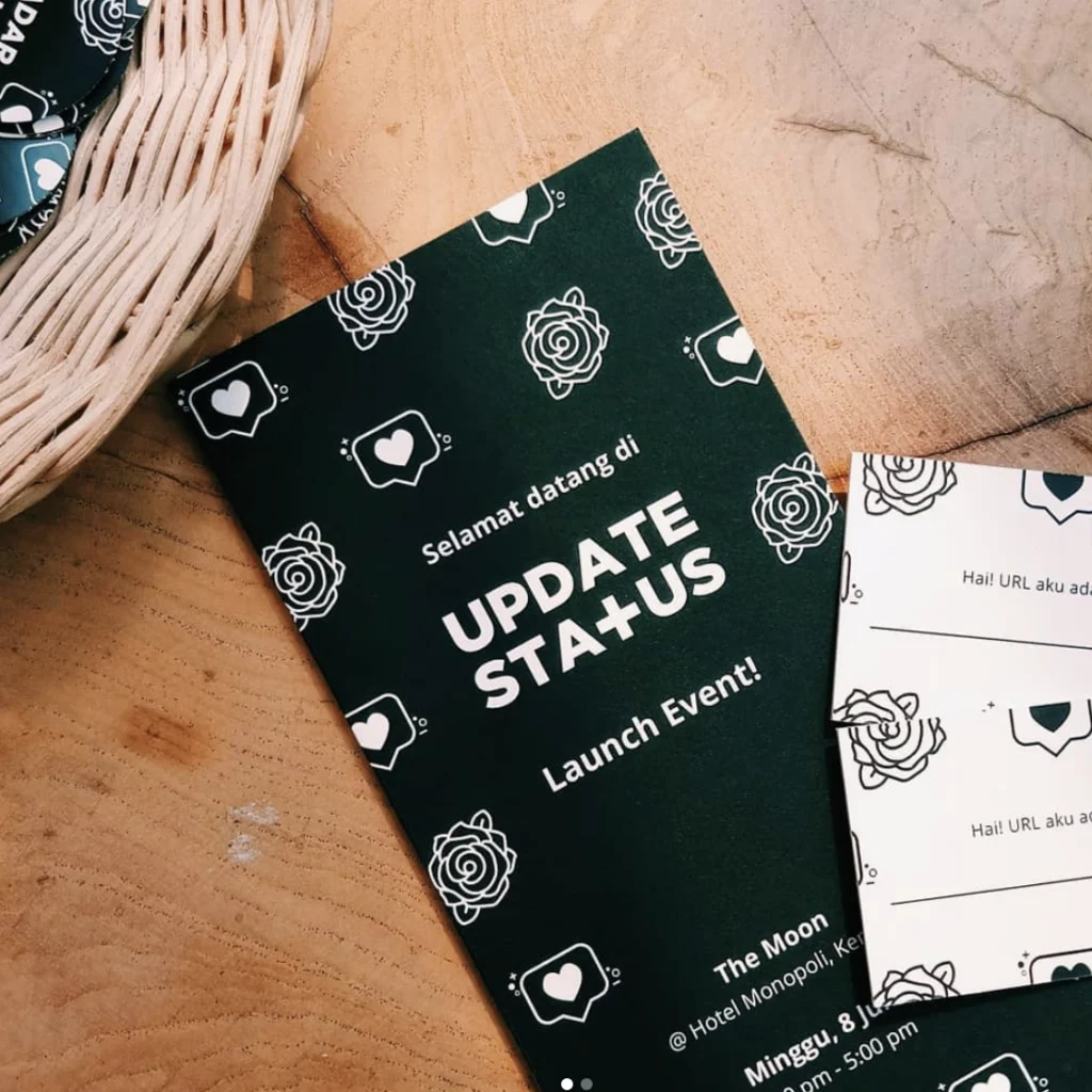



Outcome & Gallery
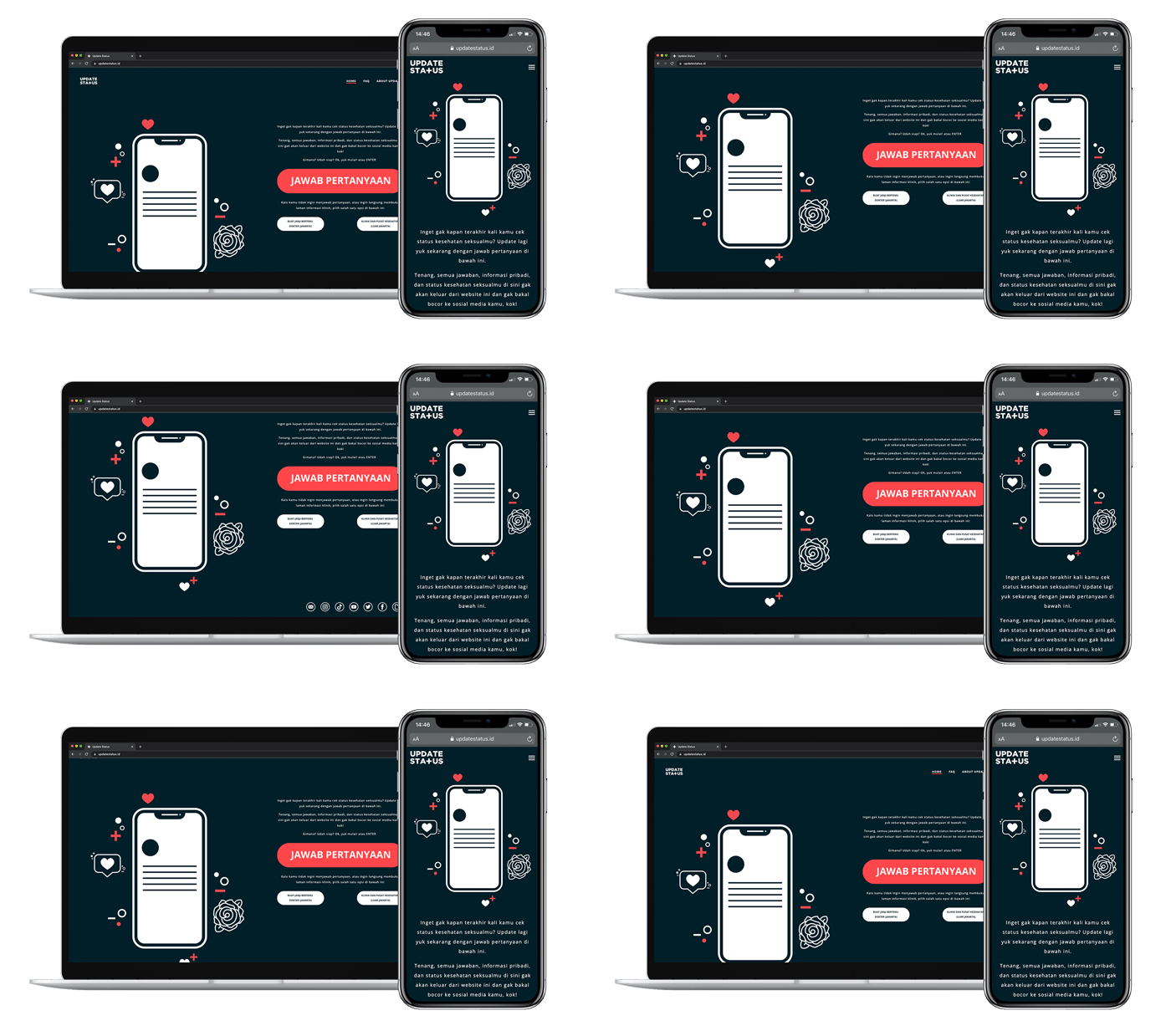
Since most of our content goes live on our social media, having a clear guide on looking is an important part. That’s why we incorporate text, photography, supergraphics, and patterns in different ways throughout the campaign to add visual diversity while keeping the brand identity strong, clear, and cohesive. In addition, social media posts have their pre-made templates, with detailed guides regarding which part of the image should contain which asset or information.

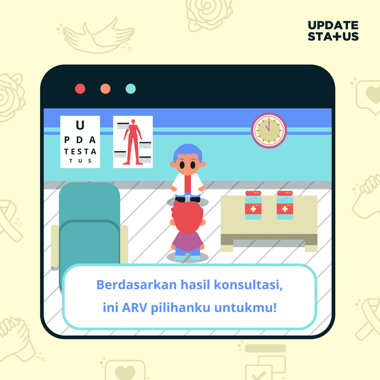
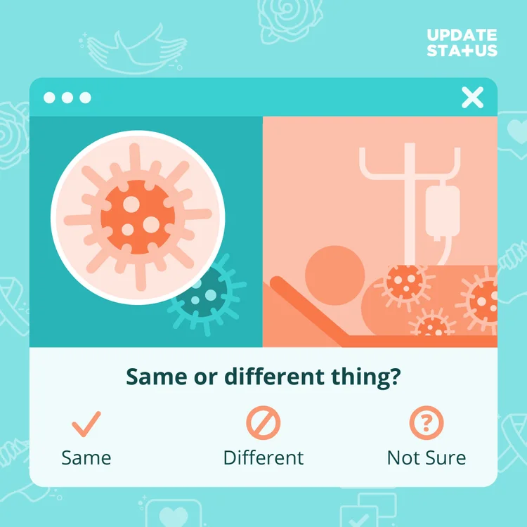
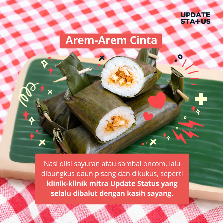

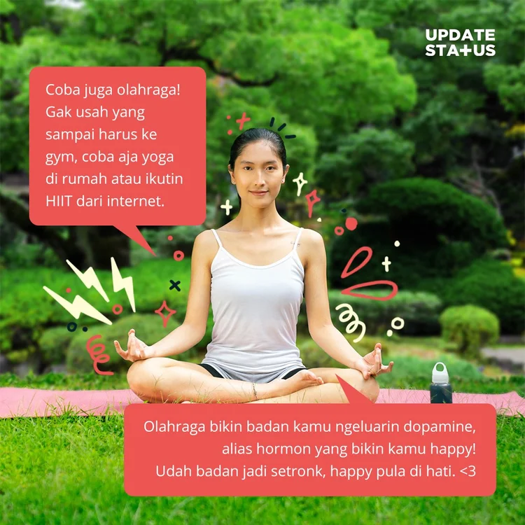
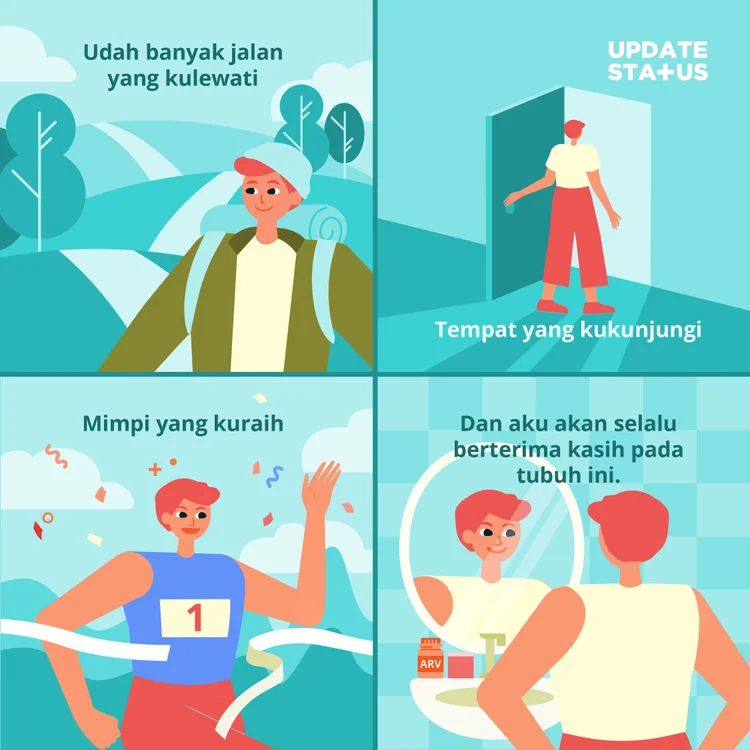
For motion graphics, our idea of simplicity still stands.
Both our characters’ art direction and movement are designed to be not too realistic and complicated. We don’t shy away from using silhouette characters for medical and technical-focused content. We will still use a character with facial expression if the content is centred in storytelling with a clear subject.




Reflection
Answer people’s questions without talking down to them.
Narrowing the audience made the brand sharper everywhere, from the colour palette down to the verbal tone — proof that focus is its own kind of design decision.
Credits
Creative direction — Muhammad Fajrur Rahmat
Studio — Percolate Galactic
Client — Update Status
Supported by — USAID, FHI 360, EPIC
Year — 2021
